
Editing an Argus command
How the Argus command editor is organised — Component, C# Blocks, and Utils — and how to edit each part.
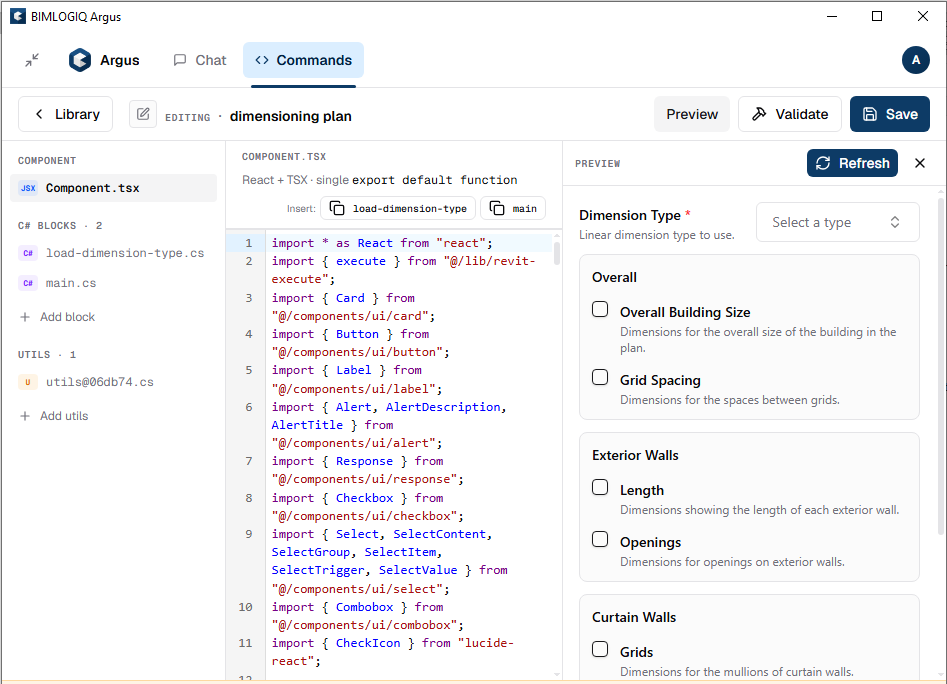
An Argus command is edited entirely inside the built-in command editor. When you open a command for editing, Argus shows a three-column layout:
- a left rail listing every block that makes up the command,
- a code editor in the middle for whichever block you selected, and
- a live preview panel on the right that renders the panel exactly as it will appear in the Argus chat.
At the top of the editor you’ll see three actions — Preview, Validate, and Save — plus the name of the command you’re editing.
Anatomy of a command
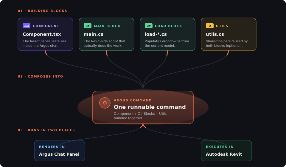
At a glance, a command is a Component + one or more C# Blocks (+ optional Utils) bundled together. The Component renders in the Argus chat panel; the C# Blocks execute inside Autodesk Revit.
What you can edit
The left rail groups the command into three sections:
- Component — the React panel users see in the chat
- C# Blocks — the Revit-side scripts that actually do the work
- Utils — optional shared helpers for the C# blocks
Everything else about the command (its identifier, Command Library icon, help link, supported Revit versions) is managed by Argus for you. You never edit those directly.
Component
The Component block is a single Component.tsx file. It renders the input form users fill in and calls the C# blocks to run the actual work. Every command has exactly one component and it exports a default function called GeneratedCommand:
import * as React from "react";
import { execute } from "@/lib/revit-execute";
import { Card } from "@/components/ui/card";
import { Button } from "@/components/ui/button";
import { Label } from "@/components/ui/label";
import { Combobox } from "@/components/ui/combobox";

export default function GeneratedCommand() {
  const [running, setRunning] = React.useState(false);
  const [error,   setError]   = React.useState<string | null>(null);

  // Inputs the user fills in
  const [dimensionType, setDimensionType] = React.useState<string>("");

  // Options loaded from the model on mount
  const [dimensionTypeOptions, setDimensionTypeOptions] = React.useState<
    Array<{ value: string; label: string }>
  >([]);

  React.useEffect(() => {
    (async () => {
      const r = await execute(runtime.getCode("load-dimension-type"));
      const out = r.output as { items?: Array<{ id: string; name: string }> } | null;
      if (r.ok && out?.items) {
        setDimensionTypeOptions(out.items.map(x => ({ value: x.id, label: x.name })));
      }
    })();
  }, []);

  const onRun = async () => {
    setRunning(true);
    setError(null);
    const code = runtime.getCode("main", { dimensionType: Number(dimensionType) });
    const r = await execute(code);
    if (!r.ok) setError(r.error ?? "Execution failed.");
    setRunning(false);
  };

  return (
    <Card className="p-4 flex flex-col gap-3">
      <Label>Dimension Type</Label>
      <Combobox
        options={dimensionTypeOptions}
        value={dimensionType}
        onValueChange={setDimensionType}
        placeholder="Select a type"
      />
      <Button onClick={onRun} disabled={running || !dimensionType}>
        {running ? "Creating…" : "Create dimensions"}
      </Button>
      {error && <p className="text-red-500 text-sm">{error}</p>}
    </Card>
  );
}
Two runtime helpers are always available inside the component:
| Helper | Purpose |
|---|---|
runtime.getCode(blockName, values?) |
Compiles the named C# block (e.g. "main" or "load-dimension-type") into a payload, injecting typed input values from the UI. |
execute(code) |
Sends the payload to Revit and returns { ok, output, error }. |
Inserting a C# block from the toolbar
Above the code editor there’s an Insert toolbar showing every C# block in the command (for example load-dimension-type and main). Clicking one drops a ready-made runtime.getCode("…") call at your cursor position so you don’t have to remember the block name.
The Argus UI kit
The preview panel renders your component using Argus’s built-in UI kit. Common imports:
import { Card, CardContent, CardHeader } from "@/components/ui/card";
import { Button } from "@/components/ui/button";
import { Input } from "@/components/ui/input";
import { Label } from "@/components/ui/label";
import { Checkbox } from "@/components/ui/checkbox";
import { Select, SelectContent, SelectGroup, SelectItem,
         SelectTrigger, SelectValue } from "@/components/ui/select";
import { Combobox } from "@/components/ui/combobox";
import { Alert, AlertTitle, AlertDescription } from "@/components/ui/alert";
import { Badge } from "@/components/ui/badge";
import { Response } from "@/components/ui/response"; // renders Markdown from Logger
Use Combobox for searchable dropdowns, Select for short static lists, and Checkbox for booleans. Group related toggles inside nested <Card> blocks to keep the panel scannable.
C# Blocks
C# Blocks are the scripts that actually run inside Revit. Every command has one main block; commands that need to populate dropdowns from the current model also have one or more load-… blocks (for example load-dimension-type, load-grid-type, load-source-categories).
Every C# block follows the same shape: an Inputs class, an Output class, and a Run(Inputs input) method.
main — the block that does the work
using Autodesk.Revit.DB;
using Autodesk.Revit.UI;
using System.Linq;

class Inputs
{
    public string[] VerticalNames   { get; set; }
    public string[] HorizontalNames { get; set; }
    public long?    GridType        { get; set; }
    public string   StartX          { get; set; }
    public string   StartY          { get; set; }
}

class Output
{
    public int VerticalGridCount   { get; set; }
    public int HorizontalGridCount { get; set; }
}

Output Run(Inputs input)
{
    Document doc = UIDoc.Document;

    // …use input.VerticalNames, input.GridType, etc. to do the work…

    return new Output
    {
        VerticalGridCount   = input.VerticalNames.Length,
        HorizontalGridCount = input.HorizontalNames.Length,
    };
}
Rules for Inputs:
- Every value the component collects becomes a public property.
- Use
PascalCase— the component sendscamelCaseand Argus converts automatically (dimensionTypein TSX →DimensionTypein C#). - Supported types:
string,int,int?,long,long?,double,double?,bool,bool?, plus arrays of any of those. - Use nullable types for optional inputs.
Rules for Output:
- Anything you want to send back to the component (counts, ids, messages) goes here.
- The component reads it as
r.output.
load-… — dropdown loaders
Whenever a form needs a dropdown filled with data from the current model, add a load-… block next to main. It uses the same shape but doesn’t modify the model:
class Inputs { }

class GridType
{
    public string Id   { get; set; }
    public string Name { get; set; }
}

class Output
{
    public GridType[] Items { get; set; }
}

Output Run(Inputs input)
{
    Document doc = UIDoc.Document;
    var items = new FilteredElementCollector(doc)
        .OfCategory(BuiltInCategory.OST_Grids)
        .WhereElementIsElementType()
        .Select(e => new GridType { Id = e.Id.ToString(), Name = e.Name })
        .OrderBy(x => x.Name)
        .ToArray();
    return new Output { Items = items };
}
The component then calls execute(runtime.getCode("load-grid-type")) on mount and hands the returned items to a Combobox.
Global context in every C# block
Inside every Run(...) you have a few helpers injected automatically — no using needed beyond the Revit namespaces:
| Symbol | Type | Purpose |
|---|---|---|
UIApp |
UIApplication |
Application-level access (settings, active add-ins). |
UIDoc |
UIDocument |
Active document, selection, and view. |
Logger |
StringBuilder |
Append Markdown that surfaces in the Argus output panel. |
CheckCancellationRequested() |
void |
Call inside loops so the user can cancel gracefully. |
ProgressUpdate(state, steps, total) |
void |
Report progress back to the chat panel. |
Do not declare or initialise these — they’re provided for you.
Utils
The Utils section holds shared C# helpers for your main and load-… blocks. Argus compiles everything in the command together, so any class or method you define here is visible from every C# block.
Reach for utils when the same piece of logic — a geometry helper, a parameter reader, a formatter — is needed in more than one block.
Preview, Validate, Save
Once you’ve edited the Component and any C# blocks, use the three buttons in the top-right of the editor:
- Preview — refreshes the live preview panel on the right using your latest code. Users on the receiving end see this exact panel in the chat.
- Validate — statically checks the command: block IDs,
Inputs/Outputshapes, TypeScript compile, missing imports, and naming rules. Errors appear as a banner along the bottom of the editor (for example, “Block id should be lowercase kebab-case”). - Save — commits your changes. If the command is published to a team library, saved changes propagate to your teammates the next time they open the command.
Wiring inputs between Component and Main
The keys you pass to runtime.getCode("main", { … }) map directly to the Inputs class of the main block:
runtime.getCode("main", {
  verticalNames: ["A", "B", "C"], // → input.VerticalNames  (string[])
  gridType: 123456,               // → input.GridType       (long)
  startX: "0",                    // → input.StartX         (string)
});
When you add a new input, change it in three places:
- Add a property on the
Inputsclass in themainblock. - Add React state for it in
Component.tsx. - Include it in the object passed to
runtime.getCode("main", { … }).
Typical editing workflow
- Open the command in the editor.
- Change what the model does → open the
mainblock, edit the C#. UpdateInputs/Outputas needed. - Change what the panel looks like → open the
Component, edit the TSX. Add/remove state and update the keys you pass toruntime.getCode("main", { … }). - Change dropdown data → open the matching
load-…block, or add a new one from the left rail. Fetch it from the component withexecute(runtime.getCode("load-…")). - Extract anything shared into Utils.
- Click Preview to see the panel refresh, Validate to catch mistakes, then Save.